
This text is conventional for a thriller movie title in that it is abstract and smudged, which gives the effect someone has written it in a rush.
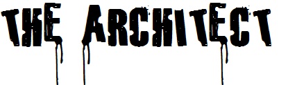
This text is also conventional for thriller and horror films. It has wonky letters, for the rushed look, gun shots, for a crime movie, and blood drops off the ends of some letters to represent the gore side of the movie.
Both of these texts are quite over the top, and not what we wanted to achieve in our film. Our target audience (20+) would more enjoy an intellectual and bold font that wouldn't distract from the picture or make the film look unprofessional.
Both of these texts are quite over the top, and not what we wanted to achieve in our film. Our target audience (20+) would more enjoy an intellectual and bold font that wouldn't distract from the picture or make the film look unprofessional.
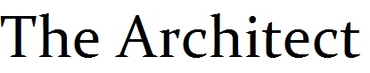
This text achieves that but doesn't create the effect of a thriller movie, although this shows the discrete look we want to achieve.

This is a contemporary Sans serif font. We decided to use this font because it reflects the feel of our contemporary thriller. It matches shallow depth of field style of filming brought about by digital still lenses that are able to capture moods. The spacing between letters is creates a simple, uncluttered and important feel that means the film can be lead by mood rather than a complicated plot with a complicated font. The font is formal which will detach the audience from the characters. We chose to keep it in capitals and the spacing of the letters maintains distance and formality.
 RSS Feed
